Role
Product Manager and Designer
Impact
Increased MRR 2x
Fields
Product Strategy
User Research
UX Design
The Problem
Leveraging analytics to create business insight
Bungee was a small start-up in the niche business intelligence space. They provided solutions to retailers trying to better understand their competitor's pricing and inventory differentiation.
Retailscape was going to be our first flagship product that leveraged the large amounts of data Bungee collected. The data was to be displayed in an intuitive B2B facing dashboard. As the Product Manager and UX designer, I was responsible for the initial conception, scope, and deliverable.
Design Challenges
Presenting large amounts of data
Right away, one of the biggest challenges facing the team was how to display and surface visualizations from huge amounts of data. One daily data set was usually as large as a 300 mb Exel file.
There were a number of ways to slice and dice the data. Our visualizations came down to two questions:
- What visualization would be useful to the business analyst / manager / engineer?
- Could we ensure consistent, high quality data?
User Research
Conducting Research Was Difficult
I wrote about my lessons for conducting B2B UX research for the first time in this article. In the end, most of our research came from a feature analysis of current industry solutions as well as understanding our existing consumer's needs.
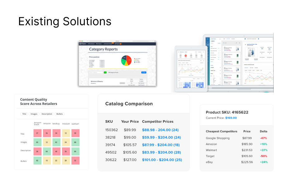
The conclusion: What Bungee lacked in manpower and technical compute power, we made up in our holistic coverage of data i.e. providing better competitive insight into the competition.
Collaborating with Engineering
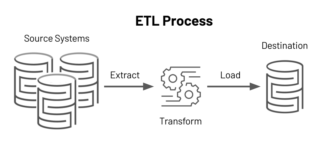
Standardizing an ETL pipeline
The quality of our data would determine how effective our visualizations were. I worked with our DevOps team to understand and finalize a set of standards of which our data would be based upon. This ensured no blanks or duplicates in our data.
Early Prototyping
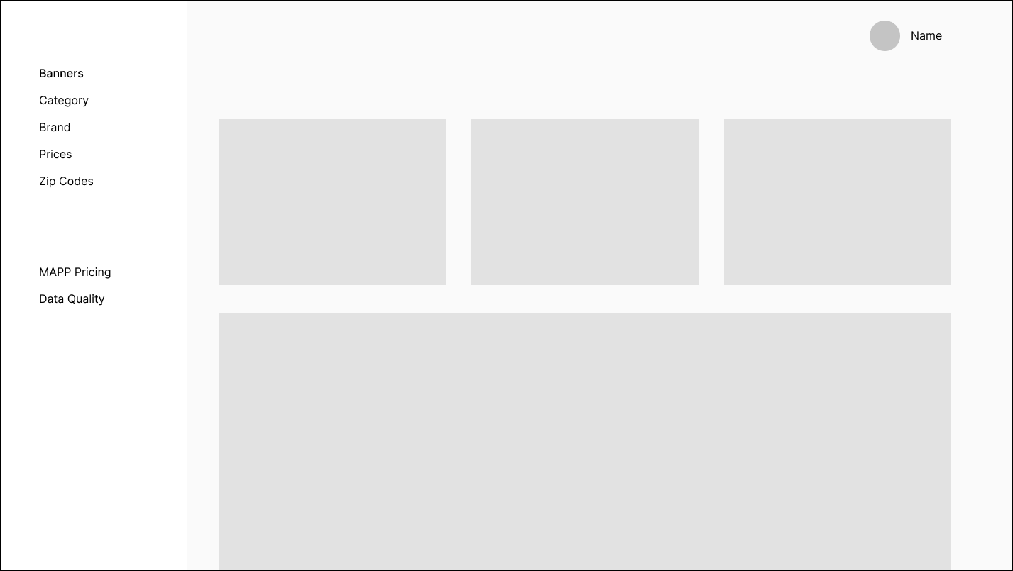
Finalizing our navigation
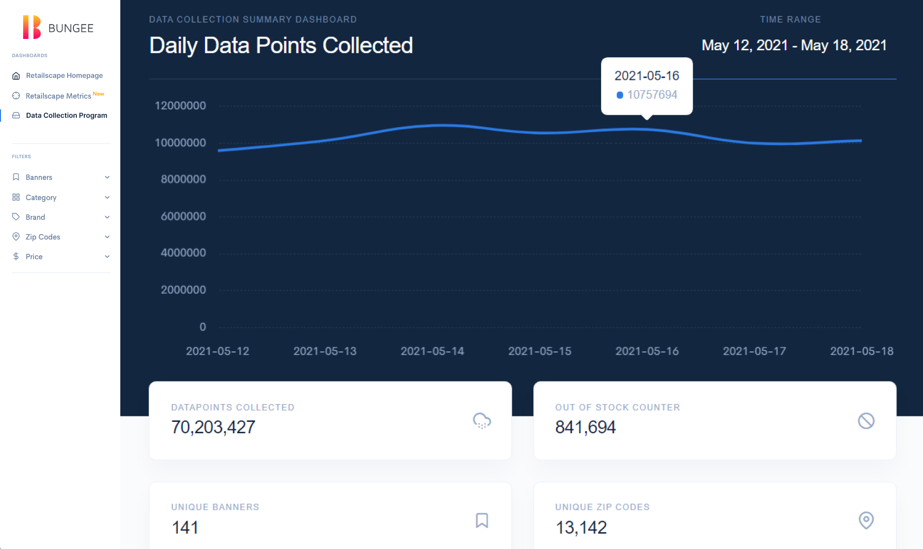
We narrowed our design scope to revolve around the common data fields of price, category, brand, and location. In addition, we added a data quality page for two reaons.
- Managers and engineers needed to track the data sources and data integrity
- Being transparent with our data collection methods and our breadth engendered more trust with our customers
Final Version
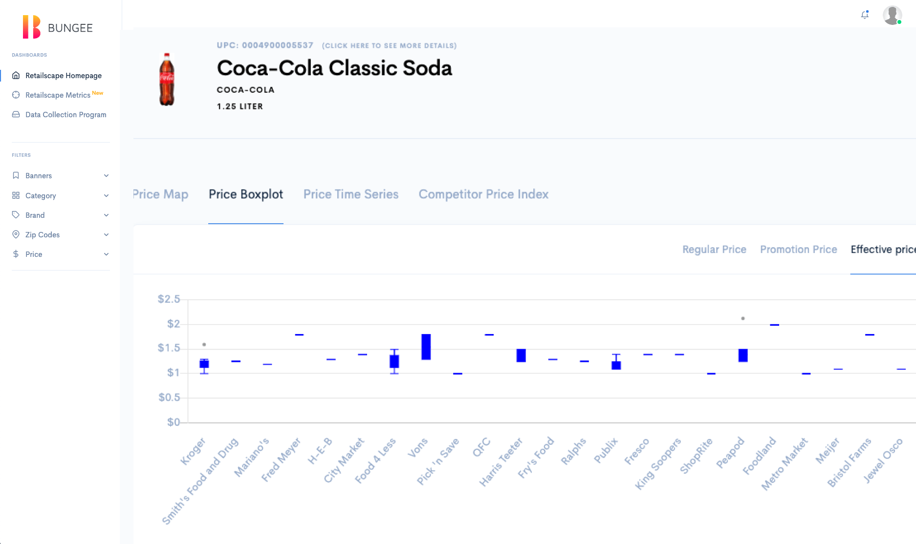
The final version offered analyts and managers multiple ways to view their data across competitor and brand. In addition, we incorporated a competitor pricing page as well as a zip code filter given that our client was eying recent expansions into different counties.
Design Lessons
This product challenged me to think critically of the type of visualizations that provided the most value. I learned that, contrary to popular usage, pie charts as well as heat-maps were neither accurate nor specific enough for action.
I also learned more about nuanced fields of retail pricing, specifically how pricing was closely monitored. This gave me a deeper appreciation into the competitive nature of retailers!